Displaying data in frequency tables and dot plots

How to display data in frequency tables and dot plots and convert between them
Think of a frequency table as a table that displays how frequently or infrequently something occurs.
A dot plot display can also be used to show the frequency of small data sets.
If I want to categorize the vehicles in a parking lot by type, I could do so in frequency table.

Hi! I'm krista.
I create online courses to help you rock your math class. Read more.
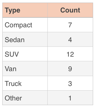
To make this table, I counted the number of cars of each type, and recorded them in the table. Since I counted ???7??? compact cars, I wrote a ???7??? next to “Compact” in the table, and since I counted ???9??? vans, I wrote a ???9??? next to “Van.”
I could have also recorded this data in a dot plot.
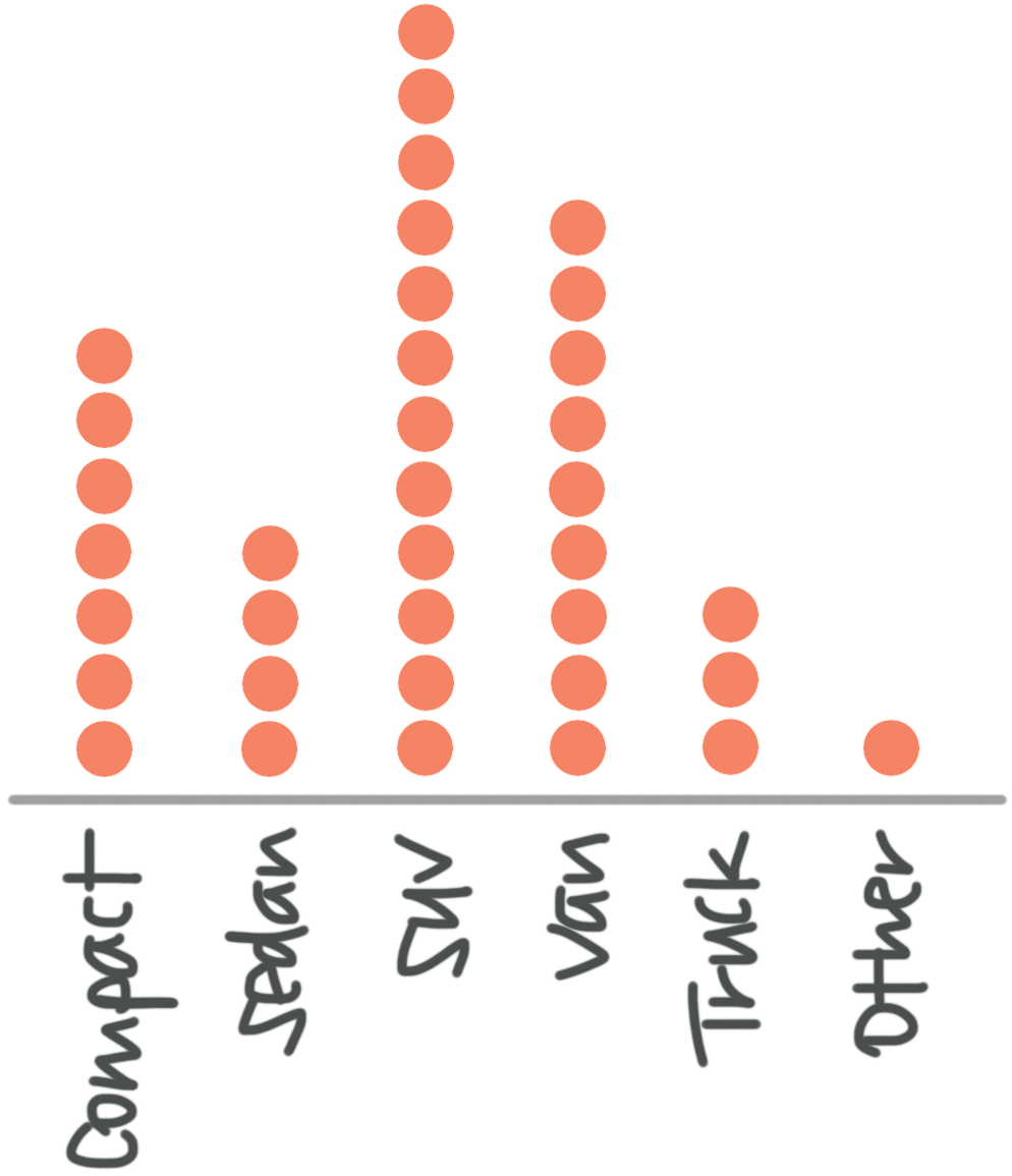
To make the dot plot, we just took the data in the frequency table and changed the counts into dots. Since we counted ???7??? compact cars and put that in the frequency table, we put ???7??? dots above “Compact” in the dot plot.
Dot plots are a lot like bar graphs, in the sense that we can very easily see which items occur most frequently, based just on the height of the dots in the dot plot, like the height of the bar in a bar graph.
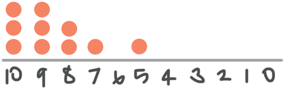
You can also convert between a list of data, a frequency table, and a dot plot. For example, ???10??? students took a quiz where they could earn scores between ???0??? and ???10???. Their scores were
???9,\ 10,\ 8,\ 9,\ 10,\ 10,\ 7,\ 9,\ 5,\ 8???
A frequency table can be created to show the frequency of any given score between ???0??? and ???10???.

Then the data from the frequency table can be turned into a dot plot.