Scatterplots and regression lines
Scatterplots account for the values of two variables at one time
A scatterplot, also called a scattergraph or scatter diagram, is a plot of the data points in a set.
It plots data that takes two variables into account at the same time. Here are some examples of scatterplots:

Hi! I'm krista.
I create online courses to help you rock your math class. Read more.
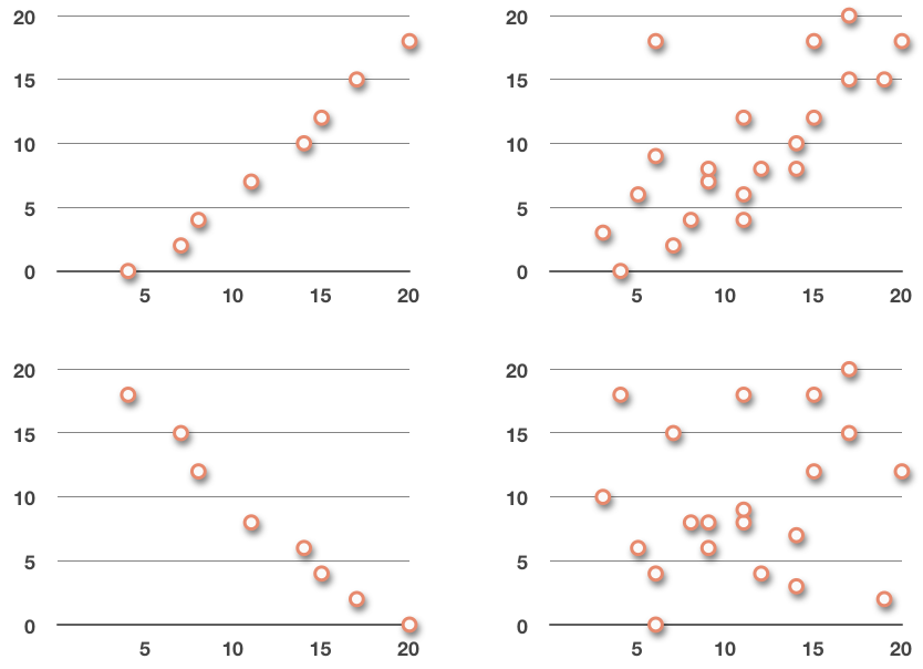
Even though scatterplots can look like a mess, sometimes we’re able to see trends in the data. For example, the two graphs on the left definitely seem to be roughly following a line: the one on top looks like it follows a line with a positive slope; the bottom one looks like it follows a line with a negative slope.
The graph in the upper right looks like it might be following a positively-sloped line, but if it is, the trend is not as clear as either of the graphs on the left.
And the graph in the lower right doesn’t look like it’s following any trend at all.
When we say that the data in a scatterplot appears to follow a trend, what we’re really saying is that it appears to follow some line, or maybe some other kind of curve, like for example an exponential curve or sinusoidal curve. No matter the shape of the curve that the data follows, we call it the approximating curve, and the process of finding the equation of the approximating curve is called curve fitting.
The regression line is one of the most important approximating curves we’ll talk about, so let’s take a look at that now.
Regression line
It was intuitive for us to start looking for trends in the scatterplots as soon as we saw the plotted points. And, in fact, spotting trends is probably what we spend most of our time doing when we work with scatterplots. The plot alone isn’t super helpful, but if we can use the plot to observe some kind of a trend in the data, then we might be able to use that trend to draw conclusions or make predictions about the data.
The most common way that we’ll do this is with a regression line. It’s the line that best shows the trend in the data given in a scatterplot. A regression line is also called the best-fit line, line of best fit, or least-squares line.
The regression line is a trend line we use to model a linear trend that we see in a scatterplot, but realize that some data will show a relationship that isn’t necessarily linear. For example, the relationship might follow the curve of a parabola, in which case the regression curve would be parabolic in nature. For the rest of this lesson we’ll focus mostly on linear regression.
Equation of the regression line
There are a few ways to calculate the equation of the regression line. The equation for a regression line is most often given in slope-intercept form, ???y=mx+b???. The regression line formula then calculates the slope ???m??? and the ???y???-intercept ???b??? using
???m=\frac{n\sum xy-\sum x\sum y}{n\sum x^2-(\sum x)^2}???
???b=\frac{\sum y-m\sum x}{n}???
In the formulas for the slope ???m??? and ???y???-intercept ???b???,
???n??? is the number of data points in the set,
???\sum xy??? is the sum of all the products of the ???x??? and ???y???,
???\sum x??? is the sum of all the ???x???-values,
???\sum y??? is the sum of all the ???y???-values,
???\sum x^2??? is the sum of all the squared ???x???-values, and
???(\sum x)^2??? is the square of the sum of all the ???x???-values.
Once we find the equation of the regression line, we denote it with ???\hat{y}???, (pronounced “y-hat”), to indicate that it’s a regression line, and remind us that it’s an approximation for the data set. So the equation of the regression line is
???\hat{y}=mx+b???
Finding the regression line through a scatterplot of data

Take the course
Want to learn more about Probability & Statistics? I have a step-by-step course for that. :)
Heading
Example
Find the least-squares line for the data set.
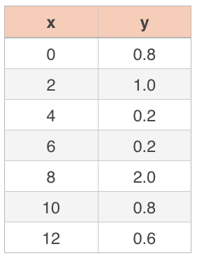
We’ll start by calculating the slope, ???m???. There are ???7??? data points in this set, so ???n=7???. It can be helpful to calculate ???xy??? and ???x^2??? for each data point, plus find the sum of the ???x???-values and the sum of the ???y???-values, and add all of these into the data table, since we’ll be using them in our calculations. Our new table that includes this extra information will be
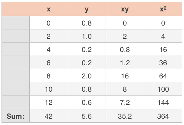
Let’s plug what we’ve found into the formula for slope.
???m=\frac{n\sum xy-\sum x\sum y}{n\sum x^2-(\sum x)^2}???
???m=\frac{7(35.2)-(42)(5.6)}{7(364)-(42)^2}???
???m=\frac{246.4-235.2}{2,548-1,764}???
???m=\frac{11.2}{784}???
???m\approx0.0143???
Now let’s plug what we’ve found into the formula for the ???y???-intercept.
???b=\frac{\sum y-m\sum x}{n}???
???b=\frac{5.6-\frac{11.2}{784}(42)}{7}???
???b=\frac{5.6-0.6}{7}???
???b=\frac{5}{7}???
???b\approx0.7143???
In statistics, we usually write the slope and ???y???-intercept to the ten-thousandths place (four decimal places) to prevent severe rounding errors from occurring in the estimated values, and giving us an inaccurate regression line. Therefore, we can say that the regression line is given approximately by
???\hat{y}=mx+b???
???\hat{y}=0.0143x+0.7143???
Let’s plot the data points on a scatterplot and then add in the regression line we found to double-check ourselves.
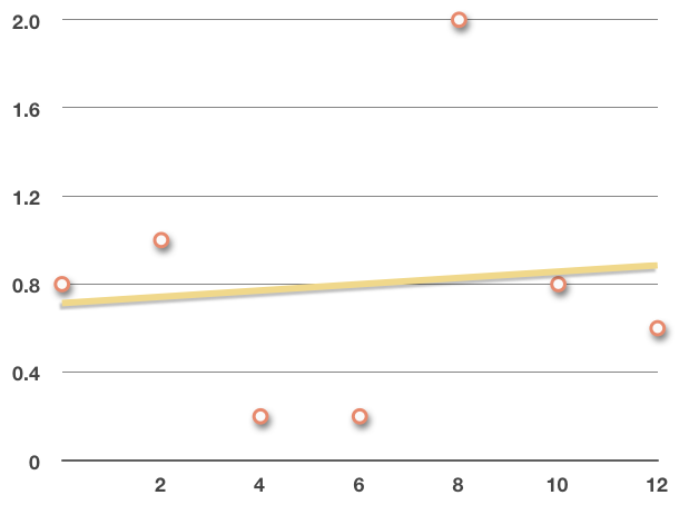
The regression line looks like it runs roughly through the data, indicating the trend.
With this last example, you might notice that the data actually wasn’t super linear. If you look at the scatterplot we made, you might even say it has more of a sinusoidal shape, and we can see that the point around ???x=8??? looks like an outlier.
So the next question we need to answer starts to become obvious, and that is “Is the regression line even a good estimate of the data?” Luckily, there are ways to measure how good of a fit this line is to the data points, and we’ll look at those techniques a little bit later on.
Describing the trend
Whenever you describe a relationship in the data, you should describe
the form (linear, parabolic, sinusoidal, etc.),
the direction (positive, negative),
the strength (strong, weak), and
the outliers (outliers, no outliers).
Form
If the data roughly follows a linear trend line, we can say the relationship is linear. If the data more closely follows a parabolic curve, we would say the relationship in parabolic. If the scatterplot just looks like one big blob, and you can’t really see any relationship in the data, then we would say there’s no relationship or correlation at all.
Linear correlation:

Parabolic correlation:

No correlation:

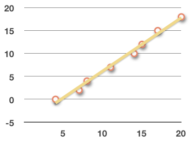
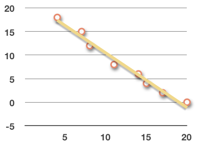
Direction
If the regression line has a positive slope, the data has a positive linear relationship; if the regression line of the data has a negative slope, the data has a negative linear relationship.
Positive linear relationship:
Negative linear relationship:
Strength
If the data is clustered tightly around its regression line, we might say it shows a strong linear relationship. If the data is loosely clustered, we might say it shows a moderate linear relationship. A weak linear relationship would be data that is spread out but still noticeably in the form of a trend line or curve.
Strong linear relationship:

Moderate linear relationship:

Outliers
Whether the data has a strong or weak relationship of any kind can also be affected by the existence of outliers, or lack thereof. Remember that an outlier is a data point that lies far away from the trend line.
If all of the data points are very tightly clustered, then there are no outliers, which means the data shows a strong relationship. But if there are some or many outliers away from the majority, then the data shows a moderate relationship.
The more outliers there are, and the further away they are, the weaker the relationship. The fewer outliers there are, and the more tightly clustered the data, the stronger the relationship.

If all of the data points are very tightly clustered, then there are no outliers, which means the data shows a strong relationship.
Example
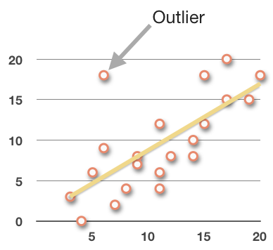
Describe any trend in the data, in terms of form, direction, strength, and outliers.

Let’s look at each part one at a time: form, direction, strength, and outliers.
Form: The scatterplot appears to have a roughly linear relationship, as opposed to a parabolic, or other relationship.
Direction: It certainly has a positive relationship, because the data moves up and to the right.
Strength and outliers: The strength of the relationship is moderate, which is due to how spread out the data points are, and the existence of outliers in the data set, like ???(6,18)???.
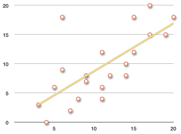
If we plot the trend line, we get
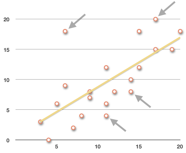
If we take out a few points that are further from the regression line, like ???(6,18)???, ???(11,4)???, ???(14,8)???, and ???(17,20)???,
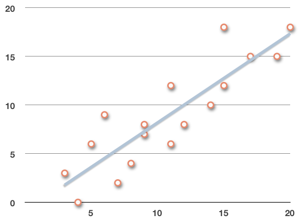
we can see that the new, adjusted regression line fits the remaining data a little bit better:
If we plot both lines on the original scatterplot, we get
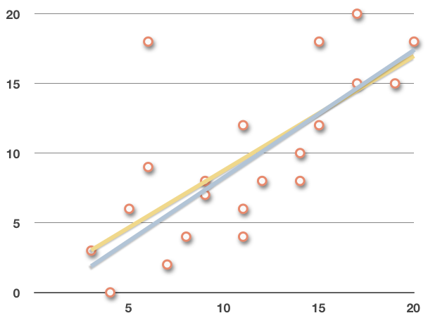
and we can see the effect that some of these outliers have on the regression line.
The purpose of regression
So what’s the purpose of curve fitting in general, or finding the equation of the regression line specifically? Well, the main purpose for finding the approximating curve, whether it’s a regression line or a regression curve with some other shape, is to come up with an equation that we can use to make predictions.
In the first example from this section, we were given a data table:
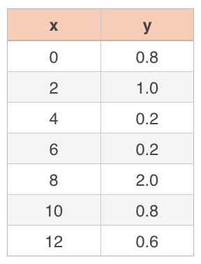
If I asked you to give me an approximate value of ???y??? for ???x=9???, or for ???x=100???, based on this data set, it’d be awfully hard to do using just the data points in the table. After all, the table doesn’t give a value for ???x=9???, and it certainly doesn’t give a value for ???x=100???.
But if we calculate the equation of the regression line that approximates the data, then we can plug ???x=9???, ???x=100???, or any other value into the equation, and we’ll get back an estimated value of ???y???.
And that’s the purpose of regression. Technically, regression is just the process of estimating the value of the dependent variable from a given value of the independent variable.