How to build bar graphs and pie charts for data sets

What bar graphs and pie charts look like
Bar graphs and pie charts are two of the simplest ways to summarize and represent data. In general, a bar graph, also called a bar chart, usually looks something like this:
And a pie chart usually looks something like this:

Hi! I'm krista.
I create online courses to help you rock your math class. Read more.
In this lesson, we’ll start with data tables like the ones we looked at in the last lesson, and try to represent the data given in the tables in bar graphs and pie charts.
Building data tables
Let’s say we’re given historical information about the host cities for the summer Olympic games, and we want to summarize this information into a simple data table.
Here is a list of host cities for the summer games, not including host cities for canceled games, from 1896 through 2016.

If we wanted to make a data table showing the number of times each continent has hosted to summer games, we could count this number for each continent from the data table, and create a summary table for count by continent:

The summary table is often called a frequency table, which shows the frequency or count of each categorical variable. In the list of host cities of summer games, the categorical variable, Europe, appeared ???16??? times, which is why the count, or frequency is ???16???.
Examples of how to create bar graphs and pie charts from data sets


Take the course
Want to learn more about Probability & Statistics? I have a step-by-step course for that. :)
How to build a bar graph step-by-step
Building bar graphs
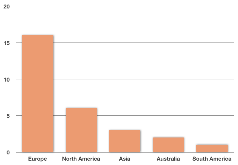
If we wanted to express the count of summer games by continent in a bar graph, it might look like this:
Notice that we have a list of the continents across the bottom of the bar graph, with the count of the number of times they’ve hosted the summer games up the left side. The continents are the individuals, and the count is a quantitative variable, because the count is a numeric property of each of the individuals.
The bar graph is a nice way to represent this data, because we can quickly get a visual picture of which continents have hosted the summer games most often.
Now we can quickly see that Europe has hosted more summer games by far than any other continent, North America has hosted the second-most number, and South America has hosted the summer games the fewest number of times. With this particular data set, since we know there arecontinents, we could infer from the graph that Africa and Antarctica have never hosted the summer games.
Bar graphs can also be built horizontally.

When you build a vertical bar graph, it’s common to sort the data largest to smallest, so that the tallest bars appear on the left, in descending order down to the smallest bars on the right. When you build a horizontal bar graph, it’s common to put the largest bars at the top and the smallest bars at the bottom.
Reading bar graphs
If we only have the bar graph, and no data table to work with, we may only be able to get approximate values from the bar graph. Using this bar graph again,

we see that the vertical axis isn’t marked off at every increment, only at every increment of ???5???. So based on how far up the bar extends for Europe, for example, we only know with absolute certainty that Europe has hosted between ???15??? and ???20??? times. We could probably guess that they’ve hosted about ???16??? or ???17??? summer games, but we might not feel absolutely sure.
At quick glance we would know that Australia has probably hosted only ???2??? or ???3??? times.
It’s worth making the point that bar graphs aren’t always great at expressing exact values, but they’re excellent at giving us a quick visual picture of data.
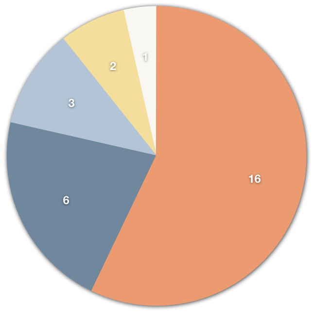
Building pie charts
This same data can be displayed in a pie chart. It’s helpful in a pie chart, though not necessary, to make each individual a different color so that it’s easy to see the distinction between sections.
Like the bar graphs, it’s customary to put the largest slices next to each other, in order all the way down to the smallest sections.

Bar graphs and pie charts can both be used to illustrate the same information.
Example
Create a bar graph and pie chart that shows the number of times each continent has hosted the winter Olympic games. Use the data table to first create a summary table, then build the bar graph and pie chart.
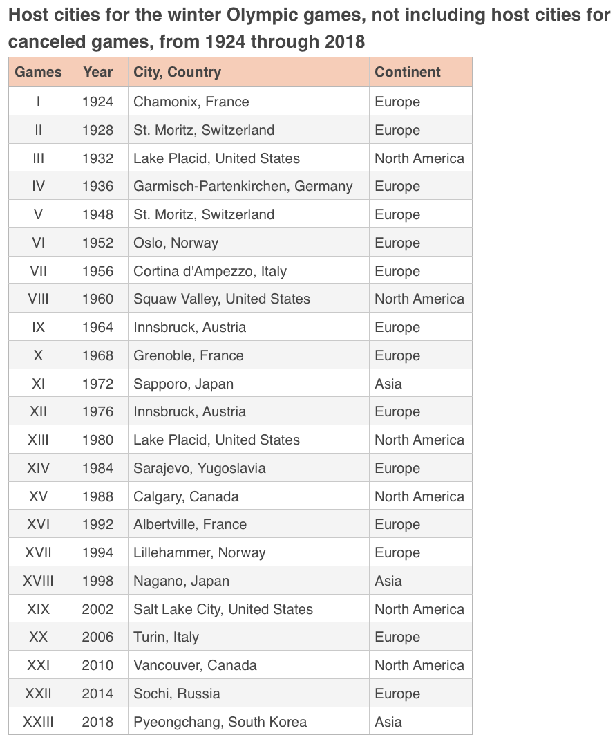
If we try to make a frequency table first of this information, we get

Then we can make a bar graph,

or a pie chart.

Bar graphs are also great for showing multiple variables for the same individuals, side by side. Now that we’ve created bar graphs for host continents for both the summer and winter Olympic games, let’s bring them together:

This kind of side-by-side bar graph allows us to quickly see what we already knew from the previous bar graphs, like the fact that Europe has hosted more summer games and more winter games than any other continent.
But we get more information from this, too, like the fact that Europe has hosted more summer games than it has winter games, or that North America has hosted an equal number of summer and winter games.