Two-way data compared to one-way data
Representing two-way data in charts and tables
Remember that one-way data was variable data given for individuals. For example, people and their heights, or ice cream flavors and the number of scoops of each sold.
In this section we’re transitioning to talk about two-way data, which is data which is dependent on more than one thing.

Hi! I'm krista.
I create online courses to help you rock your math class. Read more.
Sometimes we talk about two-way data in terms of independent variables and dependent variables.
In the case of one-way data, we had one independent variable, called the individuals, and one or more dependent variables, called the variables. In the case of two-way data, we have two independent categories on which the variables are dependent.
The difference between one-way data and two-data is easiest to visualize by comparing a data table for each one.
Two-way tables
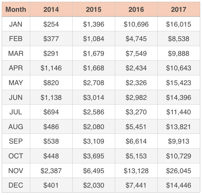
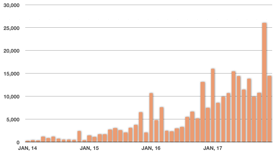
For example, let’s say that an artist started a business selling his paintings at the beginning of 2014. By the end of 2017, he’s been in business for four years, and his business has grown every year. If we add up the revenue earned all four years in January, all four years in February, all four years in March, etc., we could summarize his total earnings by month in a one-way table:
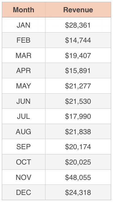
In this one-way table, we have the months down the left side. Those are the individuals (also called the independent variable). The revenue is the variable (also called the dependent variable). In this chart, the revenue the artist earned from selling his paintings only depends on one thing: the month. We can only ask questions like “How much has the artist earned in February?” or “How much has the artist earned in September?”
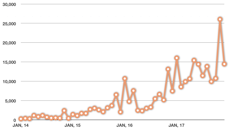
Let’s represent this as a bar graph.
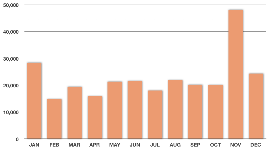
This certainly gives us information about which months tend to be best for the artist. November and January seem to be best. But since the data is summarized, adding the revenue for January for all four years into one figure, and for February, for March, for April, etc., this one-way data doesn’t give us any insight into how the artist’s business has grown over time.
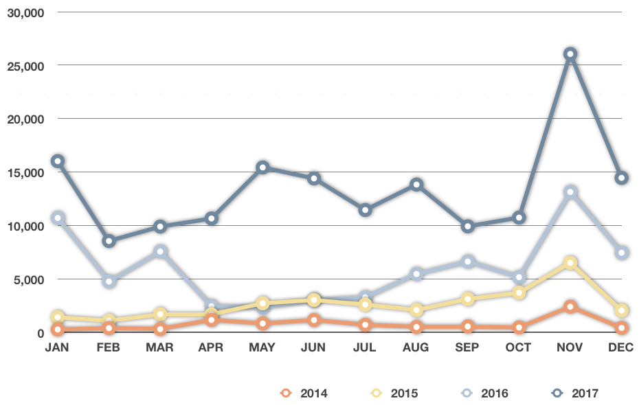
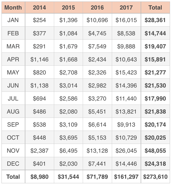
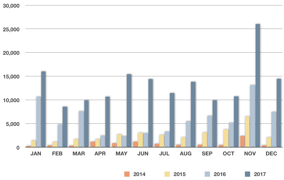
So to get more visibility, we could instead break apart the revenue information and show each year separately in a two-way table:
Notice how the data is the two-way table is now dependent on two independent things, not just one. In the one-way table, if someone asked you how much revenue the artist earned, you’d reply “For which month?” But in the two-way table, if someone asked you how much revenue the artist earned, you’d reply “For which year and for which month?” In the two-way table, each value depends on two things: the month and the year. Whereas in the one-way table, each value depended on only on thing: the month.
We could graph the data in the two-way table in lots of different ways, but let’s do it as a line graph that starts in January, 2014 and ends in December, 2017.
By giving the artist’s revenue data in a two-way table, we get so much more insight into his business.
Showing totals
In two-way tables, we can also summarize the data by row and by column, plus give a total for the entire table in the lower right-hand corner.
The difference between one-way data and two-way data

Take the course
Want to learn more about Probability & Statistics? I have a step-by-step course for that. :)
From the two-way table, we can now see the revenue totals for each month down the right side of the table (these match the totals in the one-way table), but we can also see the revenue totals for each year along the bottom. We can still see which month is best for the artist (November), but we can also see which year was best for the artist (2017).
We did a line graph to represent all of this data over time, but we could have done a bar graph, instead.

Sometimes we talk about two-way data in terms of independent variables and dependent variables.
We could also create a comparison bar graph, illustrating the revenue totals with side-by-side color coded bars for each year,
or a comparison line graph, depicting color-coded line graphs for each year.