Using line graphs and ogives to display data

Defining line graphs and ogives
Line graphs are really similar to bar graphs.
In fact, to turn a bar graph into a line graph, all you have to do is connect the middle of the top of each bar to the middle of the top of the bar beside it with a straight line, and you’ll form the line graph.

Hi! I'm krista.
I create online courses to help you rock your math class. Read more.
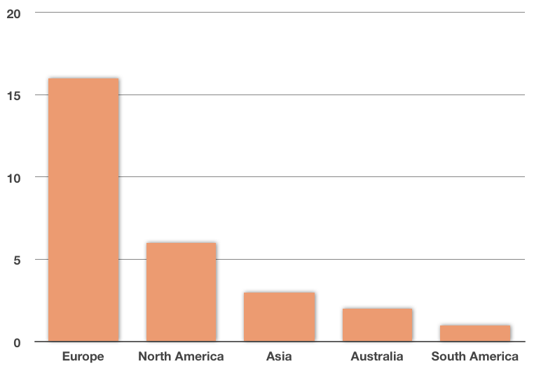
For example, we could take a bar graph for the summer Olympics from the previous section.
Then we can use straight lines to connect the top of each bar.
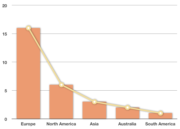
Then we can remove the bars, and we have a line graph that represents the same data.
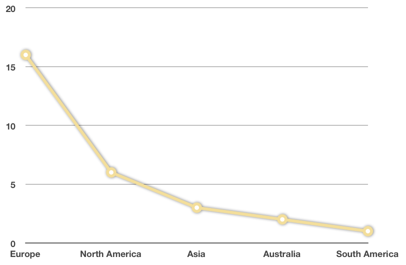
While this example is helpful for illustrating how we can transition from a bar graph to a line graph, and how the two graph types are related, in actuality, a line graph is a bad choice for this data. Line graphs are used to show changes over time or a connection between individuals, but this data is comparing things between different groups. That means the bar graph is a better choice than a line graph for this data in particular.
Let’s look at an example with data that’s much better suited for a line graph, like the monthly average high temperature in Scottsdale, Arizona over the course of a year. The data is

The historical average high temperature in degrees Fahrenheit is given for each month. If we plot these as a line graph, we get
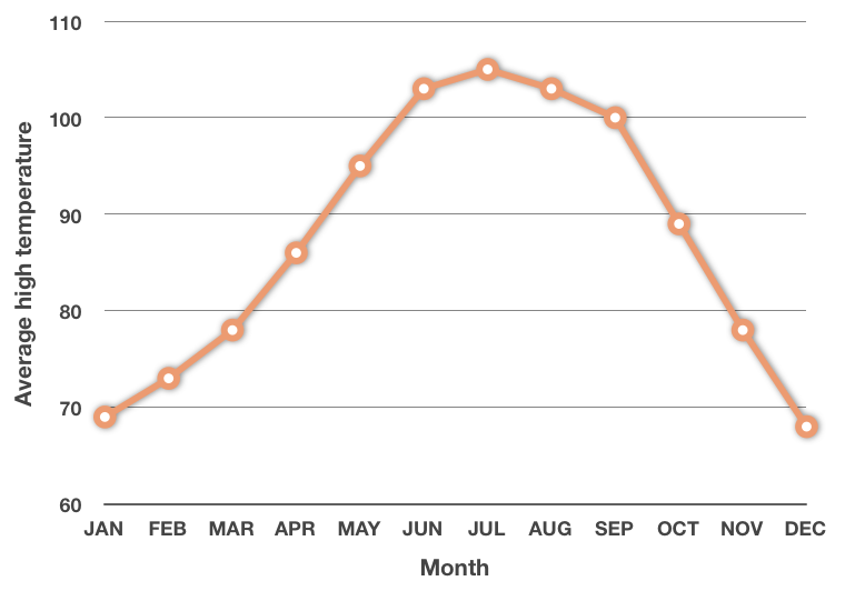
Notice that the slope of each line segment gives you and idea of how much change occurred between two data points. For example, there’s a much larger change in average high temperature between October and November than there is between June and July. The slope of the line connecting October to November is much steeper, indicating a larger decrease in temperature, than the slope of the line connecting June to July, which is much flatter, and therefore indicates a smaller increase in temperature.
A line graph is a fantastic way to display this kind of data, mostly because it shows clearly how a data point changes over time. We inherently understand that average high temperature fluctuates over the course of a year, with the highest temperatures usually occurring in the summer months, and the lowest temperatures usually occurring the winter months.
Ogives
An ogive is a special kind of line graph. This kind of graph looks just like a line graph, but think of an ogive as an “accumulated” line graph. Just like other types of graphs, an ogive does well at representing some kinds of data, and less well at representing others.
For example, it doesn’t make sense to show accumulated temperature over time. Taking the average monthly temperature in Scottsdale, if we use an ogive, we should show the temperature in January as ???69???, the temperature in February as ???69+73???, the temperature in March as ???69+73+78??? etc. The ogive would look like this:
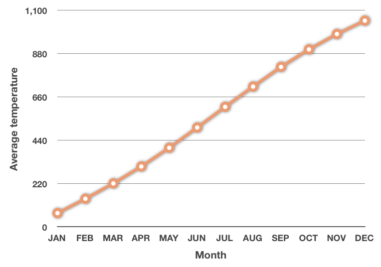
But it doesn’t make sense to have a temperature of almost ???1,100??? degrees in December. Temperature is not a very good data point to represent with an ogive.
But an ogive would be perfect for showing something like accumulated savings over time. For example, let’s say you invest ???\$5,500??? each year into a Roth IRA retirement savings account, from age ???30??? until age ???39???.

Graphing the invested amount each year in a line graph gives

While this is valuable information, you might be even more interested in the accumulated amount over time. If you find the accumulated total after each year, the data is

Graphing the accumulated total each year could be much more valuable, because it gives you visibility into how your savings will grow over time.
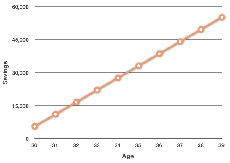
From this ogive, we can quickly see that we’ll have something between ???\$50,000??? and ???\$60,000??? once we’ve made our investment at age ???39???. Or we can see that we’ll cross the ???\$30,000??? mark once we make our investment at age ???35???.